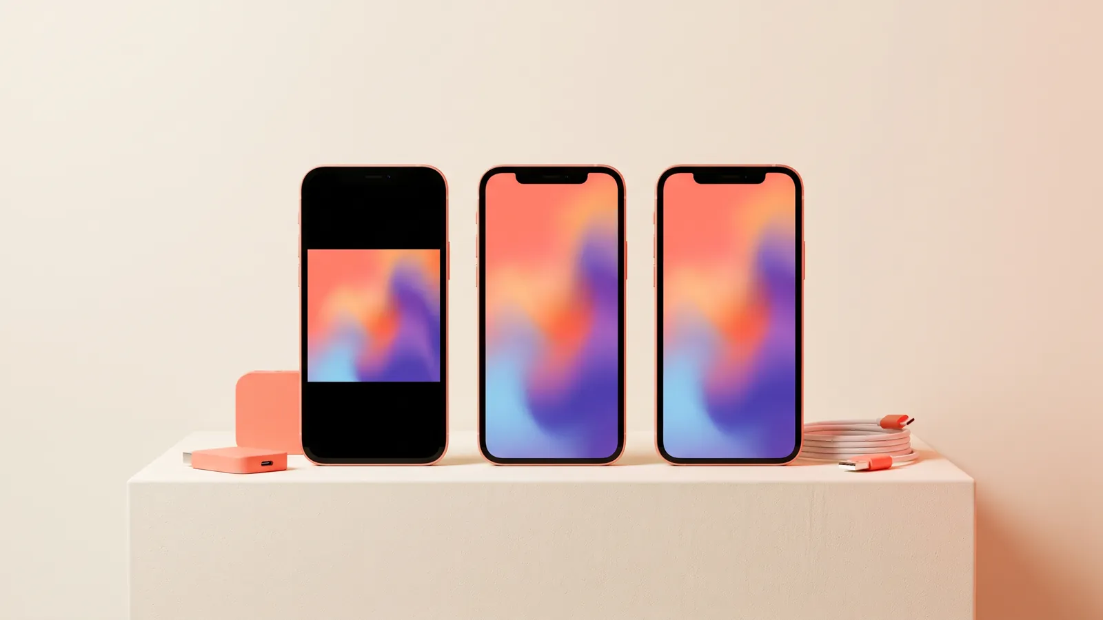
A Facebook ad mockup is a realistic preview of your ad as people will actually see it: the page name at the top, the primary text, the image or video, then the headline, link and call-to-action button underneath. You make one before launch so a client or manager can approve the ad in context, and so you catch cropped logos, cut-off text and awkward placements while they are still cheap to fix.
This guide covers why mockups are worth the effort, the placements and safe zones to design for, what a good mockup should show, a step-by-step process from creative to sign-off, and the mistakes that most often slip through to launch.
Why make a Facebook ad mockup before launch
A flat JPEG on a white background is not what anyone will see on their phone. Put the same image inside a feed or story frame and different problems appear: the headline you wrote under the image repeats the text inside it, the logo sits right under the profile name, or the offer disappears behind the reply bar. A mockup surfaces these issues before money is spent.
- Faster client approval. Clients approve what they can picture. Showing the ad in a feed removes the "how will this look?" round of back-and-forth.
- Catching crops and cut-offs. Meta fits one creative into many placements. A square image shown in Stories, or long primary text that collapses behind "See more", can change the message.
- Copy and creative checked together. The primary text, the headline and the words inside the image should work as one message, not three competing ones.
- Cheaper revisions. Changing a mockup takes minutes. Editing a live ad sends it back through review and can disrupt delivery while the campaign relearns.
- A record of what was approved. When someone asks later why the ad says what it says, you have the signed-off version to point to.
Placements and safe zones in plain words
Every placement crops, overlays or shrinks your creative in its own way. You do not need to memorise every spec, but you do need to design for the handful of placements most campaigns use.
| Placement | Ratio | Common size | What to watch |
|---|---|---|---|
| Facebook and Instagram Feed (portrait) | 4:5 | 1080x1350 | Takes the most screen space in a mobile feed. Primary text sits above, headline and button below. |
| Facebook and Instagram Feed (square) | 1:1 | 1080x1080 | The safe all-rounder. Less screen space than 4:5, but crops cleanly into more places. |
| Stories and Reels | 9:16 | 1080x1920 | Full screen, but the top and bottom are covered by app interface. Keep key content in the middle. |
| Facebook right column | Square works best | Shown small | Desktop only and shown as a small thumbnail. Fine print will not be readable. |
Feed: 4:5 and 1:1
In the feed, your creative sits between the primary text and the headline. Portrait 4:5 fills more of a phone screen, which is why many advertisers use it as the main feed format. Square 1:1 is the fallback when you want one file that behaves well in more places. Either way, keep text and logos a comfortable distance from the edges so nothing feels jammed against the frame.
Stories and Reels: 9:16 and the interface overlap
Vertical placements look full-bleed, but they are not all yours. At the top, the profile picture, account name and "Sponsored" label sit over your creative. At the bottom, the call-to-action button, caption and reply or engagement controls cover another band. Reels also stack icons down the right-hand side.
The practical rule: treat a generous band at the top and bottom as background only. Put the headline, product and logo in the middle of the frame, and keep the right edge clear on Reels. If your key line of text would be hidden under the button, it is in the wrong place.
Right column
The Facebook right column appears on desktop only, and your image shows up small beside the news feed. Use a simple, bold visual with very few words. If an ad relies on reading a detailed offer inside the image, it will not work here, and it may be better to exclude the placement.
What a good mockup shows
A useful mockup is not just the image. It shows every element the viewer will see, with the real copy in place. Placeholder text leads clients to approve a layout, then object to the words later.
- Page name and profile picture, with the "Sponsored" label, so the brand reads correctly at a glance.
- Primary text, the copy above the creative. Only the first line or two show before "See more", so the opening line has to carry the message.
- The creative in the correct ratio for that placement, not a stretched or cropped version of another size.
- Headline, the bold line under the image. Keep it short so it does not truncate on narrow screens.
- Link and description, including the display domain, so the viewer knows where they will land.
- Call-to-action button, using one of Meta's real button labels such as Shop Now, Learn More, Sign Up, Book Now or Get Offer.
Here is what complete mockup copy looks like for three kinds of advertiser:
| Advertiser | Primary text | Headline | CTA button |
|---|---|---|---|
| Coffee subscription | Roasted this week, at your door by Friday. Your first bag is half price. | Fresh-roasted coffee, delivered | Shop Now |
| Local roofer | Storm last week? We are booking free roof inspections across town this week. | Free roof inspection | Book Now |
| Online course | Learn to edit your own product photos in one weekend. No design experience needed. | Start the weekend course | Sign Up |
Notice that each headline does a different job from the primary text. The primary text sets up the problem or offer; the headline names what you get. If the words inside the image repeat the headline word for word, cut one of them.
How to make a Facebook ad mockup, step by step
- Lock the message first. Agree on one offer, one audience and one action before anyone opens a design tool. A mockup review is the wrong place to discover the client wanted a different promotion.
- Make the creative in each ratio. Produce 4:5, 1:1 and 9:16 versions of the same concept. Recompose each one rather than cropping a single file: a 9:16 version needs the headline moved into the middle band, while a 1:1 version may need the product scaled down so nothing touches the edges.
- Write every copy field. Primary text, headline, description and the call-to-action button. Write the primary text so the first line works alone.
- Place it in a frame. You have three common options. Build the ad as an unpublished draft in Meta Ads Manager and use its placement previews. Use feed and story frame templates in a design tool such as Figma or Canva. Or use a dedicated mockup generator. Ads Manager previews are the most accurate, because they come from Meta itself.
- Check it on a real phone. Desktop previews make everything look bigger and clearer than it is. Look at each version at arm's length on a phone, the way people will actually scroll past it.
- Share for review with one link. Put every placement of every option in one place, clearly labelled, and ask specific questions: which option, and does any copy need to change?
- Build exactly what was approved. Save the signed-off version, then set up the live ad from it. Last-minute "small tweaks" during setup are where unapproved changes creep in.
Tips for a faster review round
- Send two or three options, not ten. Too much choice slows decisions.
- Label versions clearly, for example "Option A - Feed 4:5", so feedback refers to something specific.
- Show every placement of an option side by side, so the client approves the set, not one size.
- Give a deadline and say what happens if there is no feedback by then.
From one concept to every ratio and a review link
The slow part of mockups is rarely the frame. It is producing the same concept in every size, keeping it on-brand, then chasing feedback through email threads and screenshots.
In Claivra, you can render one concept across square, story, portrait and other sizes in a single run, with your brand kit's colours, logo and voice applied to each. You then bundle the set into a client review link: the client opens it without an account, picks favourites and leaves comments, and you revise in place while the same URL stays live across rounds. That workflow is built for agencies juggling several clients. Use the review link for choosing and commenting, then run the approved version through the Ads Manager placement preview for the final in-feed check.
If you plan to turn the approved static into motion as well, our guide to the AI video ad generator workflow picks up from here.
Common Facebook ad mockup mistakes
- Cropping one file into every ratio. A square image cropped to 9:16 loses its edges and often its headline. Recompose each size.
- Text under the Stories interface. Offers, prices and logos placed in the top or bottom band get covered by the profile name or the button.
- Text too small to read on a phone. If you need to zoom in on the mockup to read it, so will everyone else.
- Burying the point in the primary text. If the offer only appears after "See more", most people will never see it.
- Headline and image saying the same thing. Use the headline to add information, not to repeat the image text.
- Mocking up only one placement. The client approves the feed version, then sees the story version for the first time when the campaign is live.
- Placeholder copy. Lorem ipsum gets a layout approved and pushes the real argument about wording to launch day.
- The wrong button. "Learn More" on a hard sales offer, or "Shop Now" on a lead form, creates a mismatch between the ad and what happens after the click.
If you are still choosing tools for the creative itself, see how to choose an AI ad generator.
FAQ
What is a Facebook ad mockup?
It is a preview of an ad inside a realistic feed, story or column frame, showing the creative together with the primary text, headline, link and call-to-action button. It is used to review and approve the ad before it goes live.
What size should a Facebook ad mockup be?
Use 1080x1350 (4:5) for portrait feed ads, 1080x1080 (1:1) for square feed ads and 1080x1920 (9:16) for Stories and Reels. Make a separate, recomposed version for each placement you plan to run.
Can I preview a Facebook ad without publishing it?
Yes. Meta Ads Manager shows placement previews while you build an ad, and you can leave the ad unpublished while you review it. Design-tool templates and mockup generators also work for earlier drafts.
Do I need a separate mockup for Instagram?
Instagram uses the same ratios, but the feed and story frames look slightly different. Check both in your previews, especially where text sits near the top or bottom.
How do I get a client to approve ad mockups faster?
Send a small number of labelled options in one link, show every placement side by side, use real copy, and ask a specific question with a deadline.
Ready to go from one concept to every ratio and a client review link? Start free with Claivra and send your next mockup set for sign-off today.