Most Facebook ad guides pile on pixel counts, and that is the wrong place to start. For Facebook ad sizes, the ratio is the decision. The pixel count is just the canvas you draw it on. Pick the ratio that fits your placement, and the rest follows.
Three ratios cover most Facebook and Instagram ads: 4:5, 1:1 and 9:16. This guide covers sizes only. It points you to Meta's own pages for the current numbers, because those change.
Table of Contents
- The Three Facebook Ad Sizes That Matter
- Where Each Ratio Is Used
- Pick the Right Facebook Ad Sizes for Your Ad
- Why You Should Check Meta's Specs Before Upload
- Frequently Asked Questions
The Three Facebook Ad Sizes That Matter
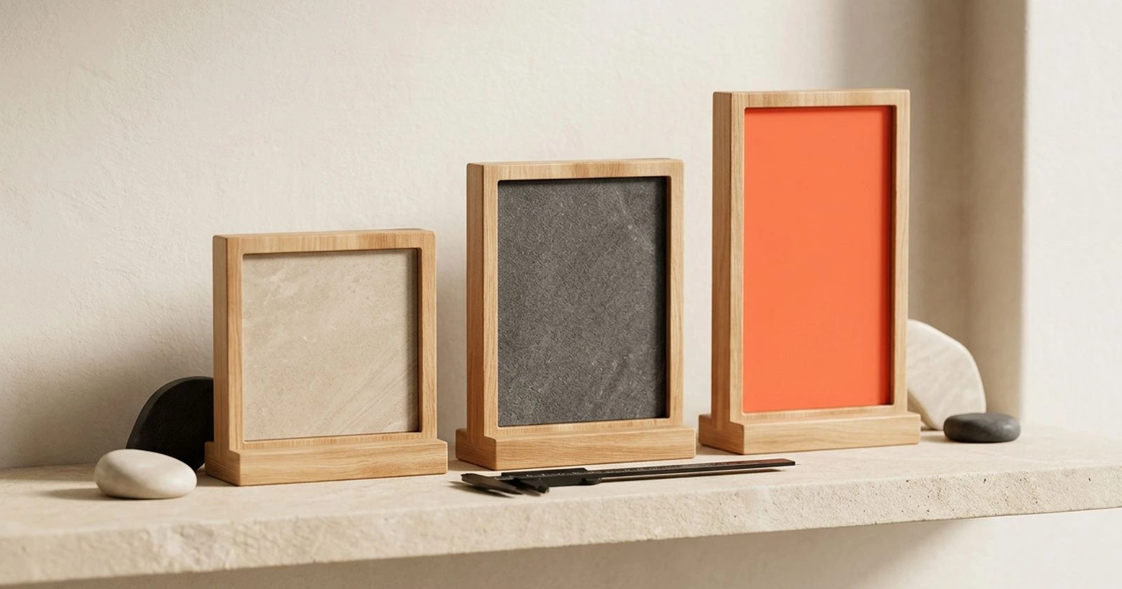
Three shapes do most of the work. Here is what each one looks like on a phone:

- 4:5 is a tall rectangle. It fills a good share of the screen as people scroll.
- 1:1 is a square. It takes less height, so it feels smaller on a phone.
- 9:16 is full-screen vertical. It fills the whole phone, the way a video call does.
Teams often build these on 1,080-pixel canvases: 1,080 × 1,350 for 4:5, 1,080 × 1,080 for 1:1, and 1,080 × 1,920 for 9:16. These are working sizes, not a rule. Meta's help pages may list higher-resolution recommendations, and newer guides point to 1,440 × 1,800 for 4:5 and 1,440 × 2,560 for 9:16.
Why do the numbers differ? People use "the size" to mean three different things. One is Meta's recommended resolution. Another is the minimum size Meta will accept. The third is the canvas your team uses day to day. Guides mix them up, which is why two articles can give two answers and both look right.
The ratio matters more than the exact pixel count. A sharp 4:5 image at either resolution still fills the same space on screen. Get the shape right first.
Where Each Ratio Is Used
Each ratio fits a different part of Facebook and Instagram. Matching them is most of the work.
4 for 5 for Feed
4:5 is the standard for Feed on both Facebook and Instagram. A taller shape fills more of the phone screen than a square, so your ad takes more of the viewer's attention. Fewer other posts compete for the same screen space.
9 for 16 for Stories and Reels
9:16 belongs in Stories and Reels, where the ad runs full-screen vertical. Push a Feed image into this space and it looks wrong. You get bars, awkward crops, or a stretched look. Build a separate 9:16 version instead.
1 for 1 as the flexible option
1:1 is the shape that still fits in many spots. You will see it on carousel cards, in older creative, and in compact placements. It is the safest fallback. Some placements may crop or reframe a square, so check the preview for each one.
Notice what this section leaves out. Where text should sit inside each frame, and what to put in the ad, are separate topics. They belong to the Instagram ad creative ideas guide. Here, we only care about the shape.
Pick the Right Facebook Ad Sizes for Your Ad
Do not try to cover every placement on day one. Use a simple rule:
- Pick one placement.
- Pick its ratio.
- Add the other sizes only if you need them.
When should you choose 4:5 over 1:1? Pick 4:5 for tall product shots, for people, and for a short line of copy that needs room. The extra height gives the idea space. A square forces you to shrink it.
Sometimes one concept needs more than one size. Rebuild it as 4:5 and 9:16 instead of stretching one file or trusting an auto-crop. A rebuild keeps the product, the face and the headline where you want them. An auto-crop decides for you, and it often cuts the part that mattered.
That is where a tool that makes several concepts from one URL saves time. Claivra's AI Facebook ad generator turns a pasted product URL into five ad concepts with images, headlines and CTAs. You can then adapt each concept into the shapes you need, rather than starting each one from a blank canvas.
Why You Should Check Meta's Specs Before Upload
Specs change. Meta updates its requirements, and every guide, including this one, can fall behind. Treat any pixel number you read here as a starting point, then confirm it on Meta's help pages before you build.
Look up these items for each placement:
- Recommended resolution
- Minimum size
- File type
- File-size limit
Also check the Ads Manager preview for each placement. The preview can crop your ad differently than you expect. A logo may sit too close to an edge, or a headline may be cut off. Looking at each preview catches this before you spend money.
Run a short check before every upload:
- The ratio matches the placement.
- The ad looks sharp at phone size.
- The text is readable.
- Nothing important sits near the edge.
If you want a faster way to start, the AI Facebook ad generator gives you concepts ready to adapt to each size. You spend your time on this check instead of on blank canvases.
Frequently Asked Questions
What is the best Facebook ad size for mobile Feed?
4:5 is the usual pick for mobile Feed. It is taller than a square, so it fills more of the screen. A common working canvas is 1,080 × 1,350, but check Meta's help pages for the current recommended resolution.
Can I use one ad size for Feed, Stories, and Reels?
You can, but it rarely looks good. Stories and Reels are full-screen 9:16, while Feed favors 4:5. A single file will be cropped or padded somewhere. Building a separate version for each is safer.
Should I use 1,080 × 1,350 or a higher resolution for 4
Both have the same shape. 1,080 × 1,350 is a common working canvas, and some newer guides point to 1,440 × 1,800 as Meta's higher recommendation. Confirm the current number on Meta's help pages and export at that size if you can.
Why does Facebook crop my ad differently in the preview?
Each placement frames the ad in its own way. A ratio that fits one spot may be trimmed in another. Check the Ads Manager preview for every placement before you publish, and rebuild the ad in the right ratio if the crop hurts it.